One Brand, Two Identities: Redefining SISTER

SISTER is the globally acclaimed production company behind some of the most celebrated television of the past decade, including Chernobyl (HBO and Sky), Black Doves (Netflix), This Is Going to Hurt (BBC) and the final series of Broadchurch (ITV).
Since the launch of the wider SISTER studio in 2019, the business has evolved far beyond traditional film and television production. By investing in and partnering with a diverse range of creative companies, it has built a world-class media group spanning scripted entertainment, documentaries, animation, podcasts, publishing and comics:
- South of the River Pictures – scripted comedy and drama, including Landscapers.
- Dorothy Street Pictures – documentaries and factual films, including Pamela, a Love Story and The Greatest Night in Pop.
- Locksmith Animation – the animation studio behind Ron’s Gone Wrong and That Christmas.
- Campside Media – narrative podcasts and investigative audio.
- AWA Studios – comics, graphic novels and screen-based intellectual property.
- Yes Yes Media – Richard Bacon’s unscripted television and interactive-entertainment company.
- Zando – an independent book publisher.
As the business continued to grow, SISTER approached us with a complex but vital brand challenge: to create two distinct yet closely connected identities.
The first was SISTER PICTURES: the production company responsible for creating the film and television audiences see on platforms and broadcasters including Netflix, HBO, Sky and the BBC.
The second was SISTER Group: the overarching identity bringing together SISTER’s growing collective of companies, investments and creative partnerships.
Part 1: SISTER PICTURES
In evolving the existing SISTER identity into SISTER PICTURES, it was essential that we retained the confidence, energy and distinctiveness the brand had established since 2019.
To achieve this, we developed a typographic system around an idea we called the “middle pinch.” In the original SISTER wordmark, the S, I, E and R are set in wide letterforms, while the central S and T are condensed. Applying the same principle to the word PICTURES allowed us to create a consistent relationship between the two words while preserving the irreverent, dynamic character of the original logo.
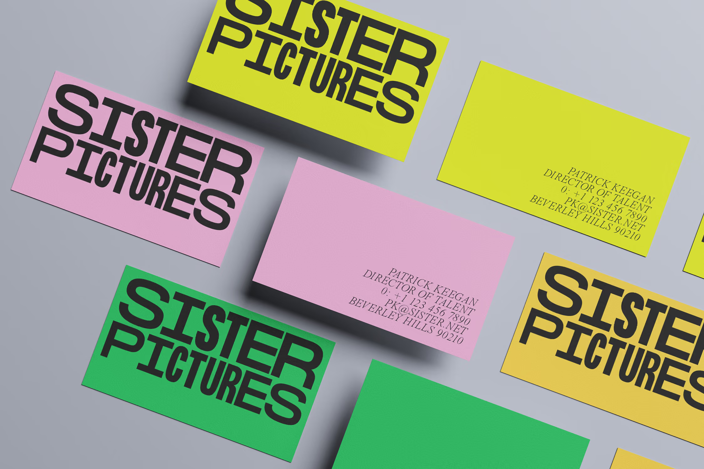
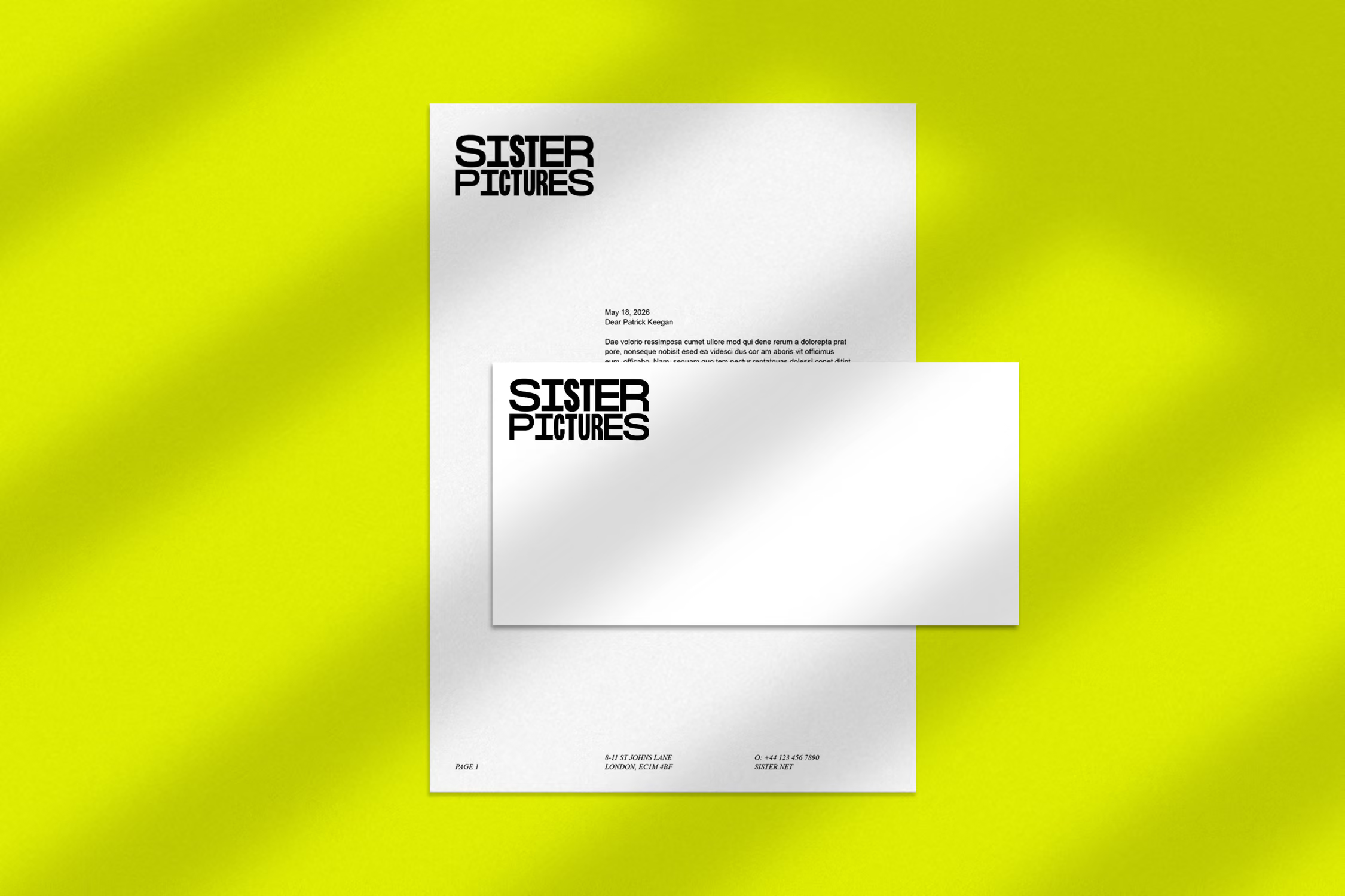
We then developed a revised colour palette and typographic system, giving SISTER Pictures a distinctive and flexible visual identity that felt unmistakably connected to the parent brand.
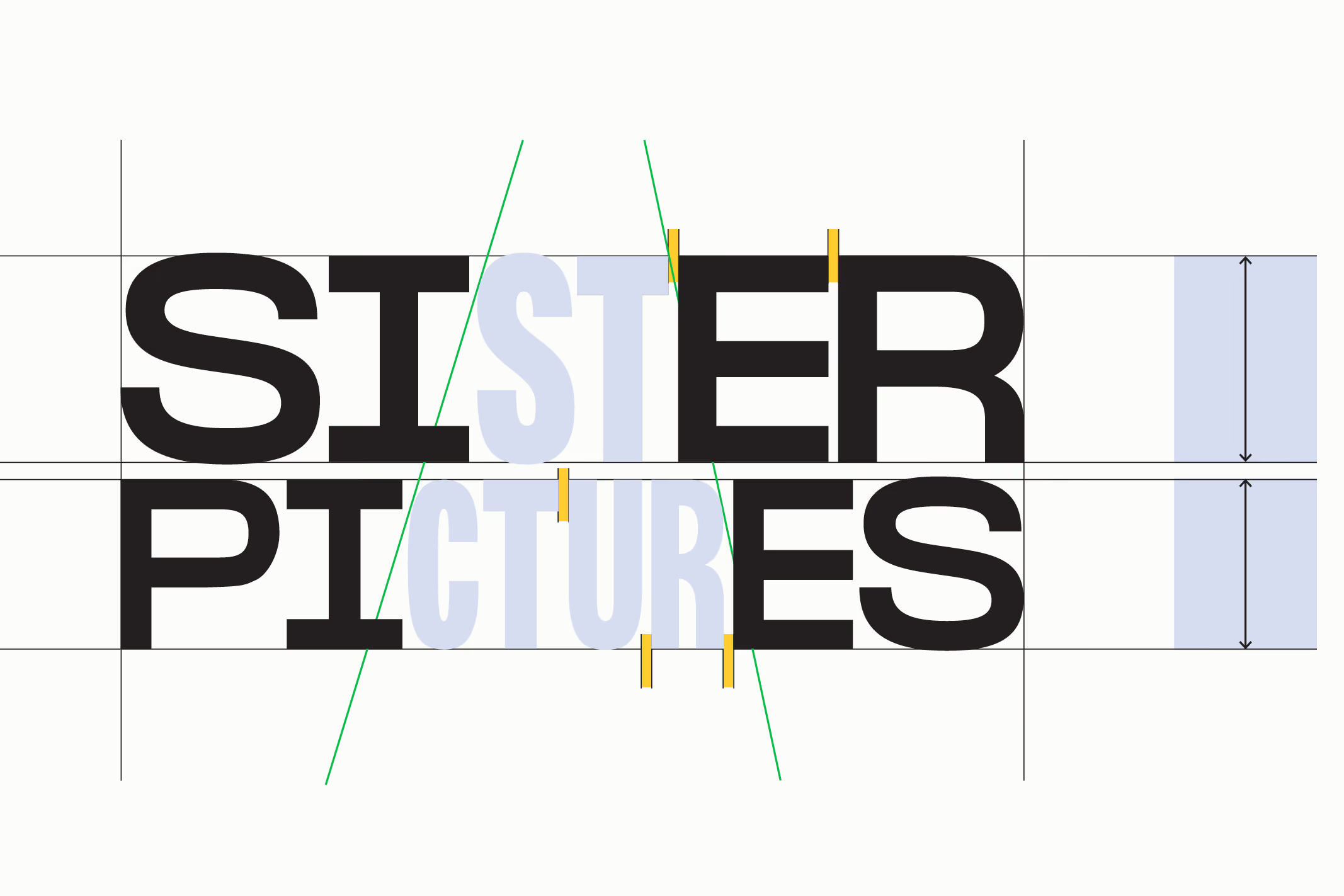
↑ The middle letters of both words 'pinch'
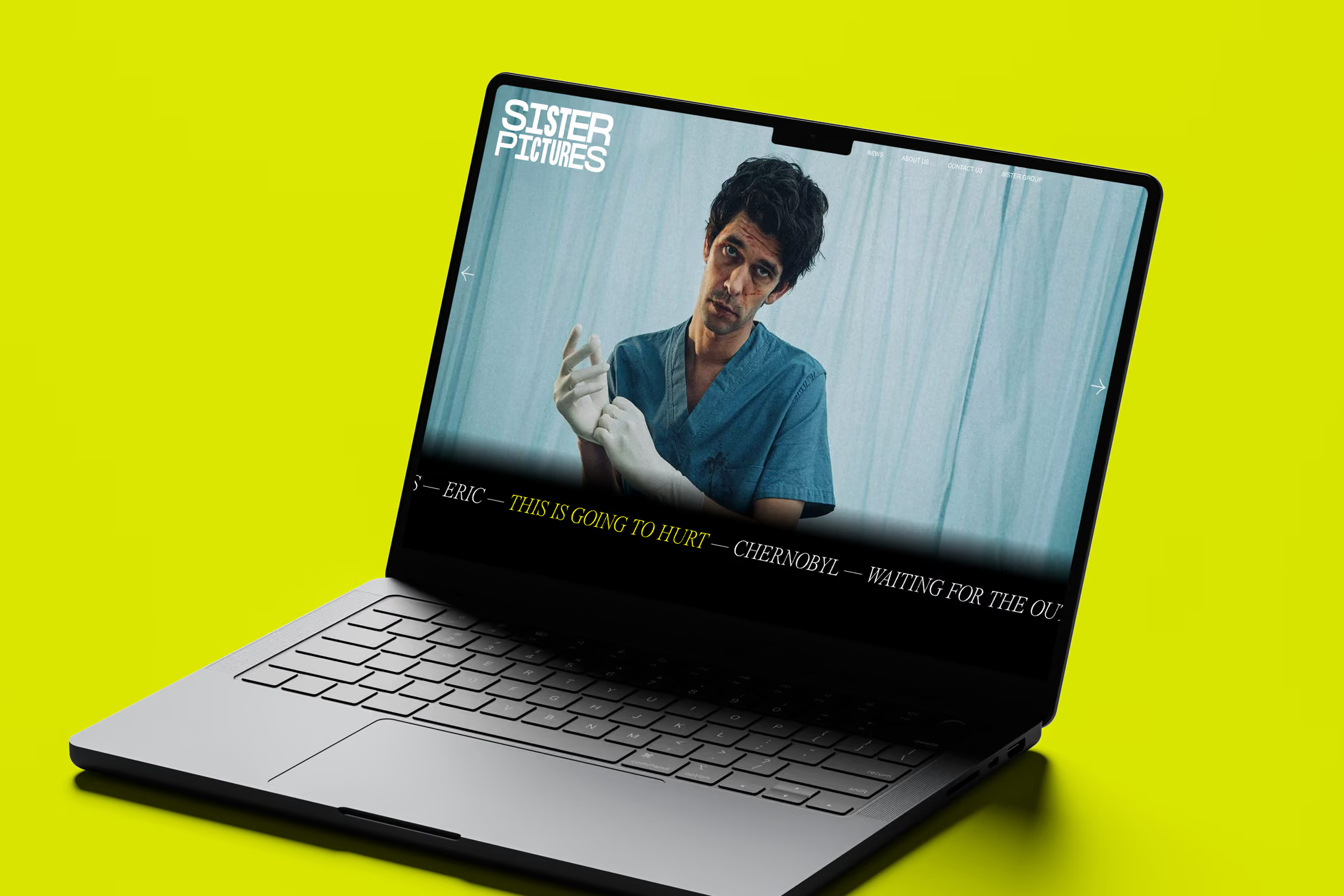
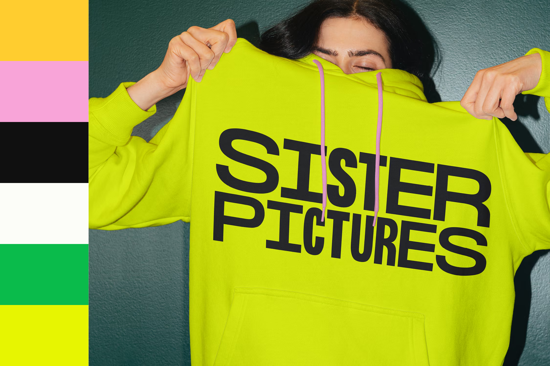
↑ SISTER Pictures' new Visual Style Guide
Part 2: SISTER Group
For SISTER Group, the challenge was to create an identity that felt clearly distinct from SISTER Pictures while remaining recognisably part of the same brand family.
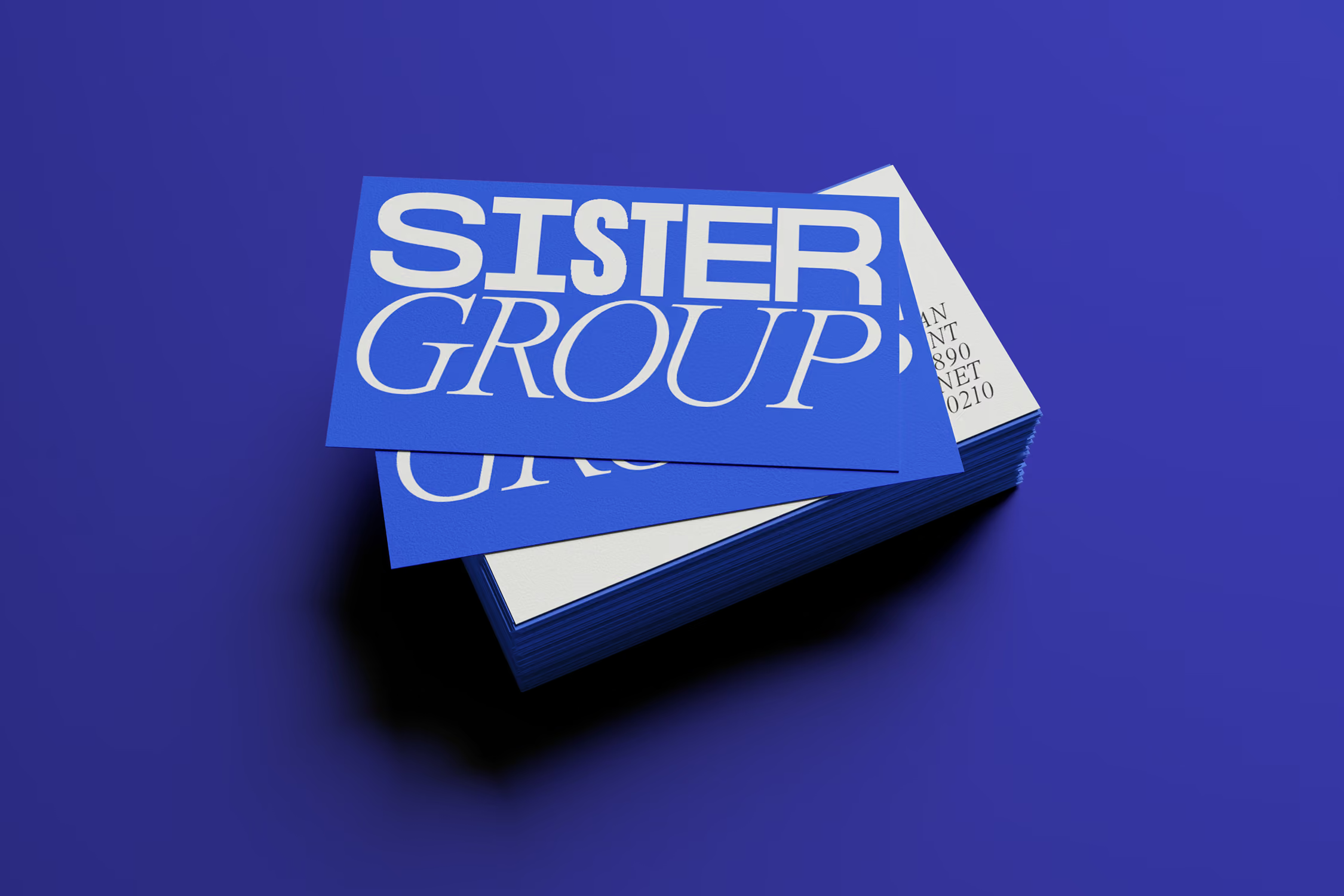
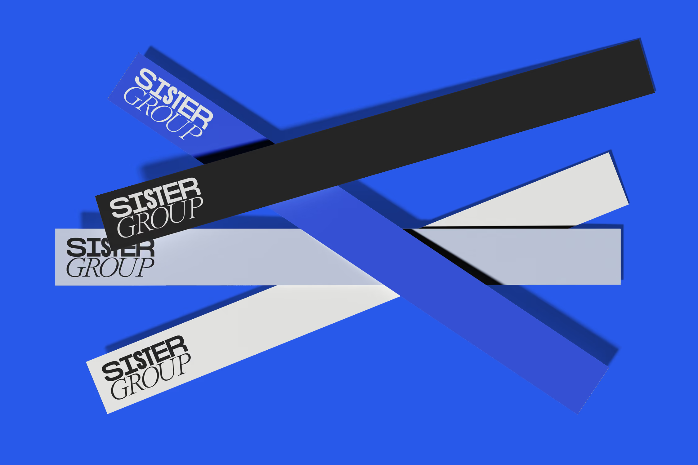
To strike this balance, we retained the original SISTER wordmark and paired it with the word GROUP in a contrasting typeface. This created a clear visual hierarchy: SISTER remained the recognisable master brand, while GROUP introduced a more corporate expression suited to its role as the overarching organisation.
We also developed a distinctive blue colour palette, creating a clear point of difference from the yellow retained by SISTER Pictures while maintaining a shared sense of confidence and energy across both identities.
Once the SISTER Group identity had been established, we brought it to life across a new website and a wider suite of brand assets. We also created a flexible co-branding system governing how the SISTER Group identity should appear alongside each partner company’s logo—allowing every business to retain its individuality while clearly communicating its connection to the wider group.
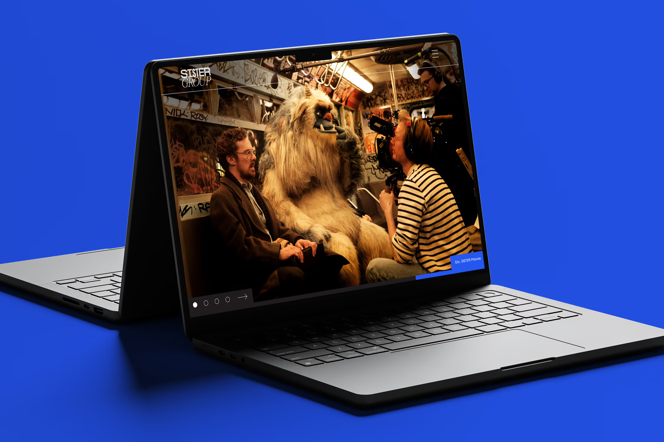
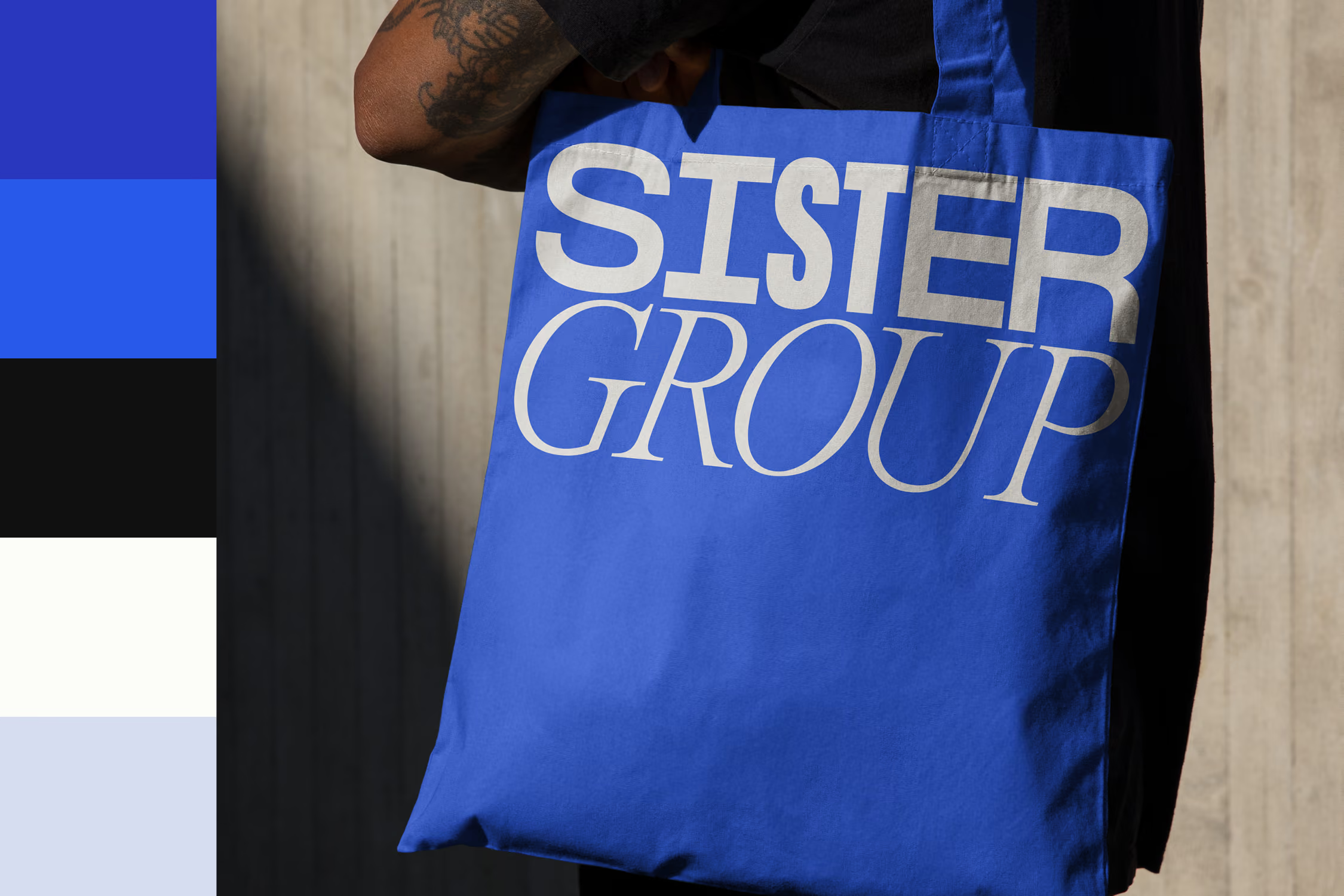
↑ SISTER Group's new Visual Style Guide
↓ View more of our work